

Email scheduling for dashboards
netlex CLM

My role
UX/UI Design, User Research, Wireframing, Prototyping, Technical Alignment with Engineering and PM
Team members:
Thais Muchon (Product Manager), João Lima (Tech Lead), Gustavo Souza (Developer)
Tools
Figma, Miro, Lovable
Email scheduling is the feature that lets netLex users receive their Intelligence dashboards automatically by email, on a recurring basis, without needing to log into the platform every time.
I led the design end-to-end: from research on how users shared dashboard data to the decision to expand scope beyond email, adding full dashboard expansion as a second delivery path. The result reduced a fully manual reporting process to a few clicks, tested and validated with real users before launch.
Project duration: 2 months
Challenge
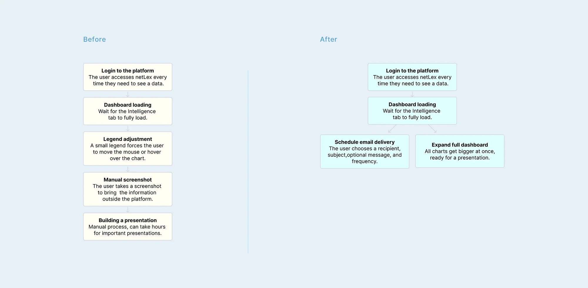
Every time a user of netLex's data intelligence needed to share or present a data, the only way was manual. Login to the platform, load the dashboard, and take a screenshot every time.
The chart legends only showed complete when the user hovered over each column, one at a time. This hover was not captured in a screenshot. So the user needed to hover column by column before each capture, and repeat this every time the data changed. This made the process slow and open to error, especially in important presentations..
Research & Validation
These design decisions weren't shaped in isolation. They came out of continuous validation cycles with two key groups:
Users and high-usage clients: they brought the real daily pain, confirmed by internal and external stakeholders who saw this demand closely with clients.
Data cross-check: we compared client complaints with internal data already recorded, to confirm the pain was not an isolated case.
This process revealed specific user needs, documented during discovery:
Automate the delivery of reports and dashboards by email
View labels and legends complete and readable, without needing to hover
Same platform, different jobs to be done
Managers, doers, and implementers needed different things from the same dashboard
Managers and account admins: needed the full picture delivered automatically, without logging in, this became the email scheduling path.
Doer: the hands-on users actually running day-to-day operations, needed to check a chart fast, without building a full report, this became the single chart expansion.
Implementation team and internal users: used both paths, depending on whether they needed a quick check or a full report to share.
User Experience Flow
Starting the Process
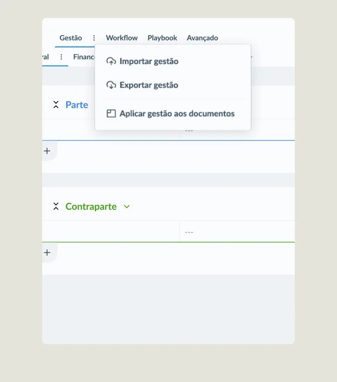
Backfilling starts from the model's menu. A modal explains what the feature does and how it keeps document history.
Setting Up AI and Confirming
Users can choose when AI helps fill in missing data. Before running the update, a summary shows how many documents will change, how long it will take, and key warnings
Running and Getting Results
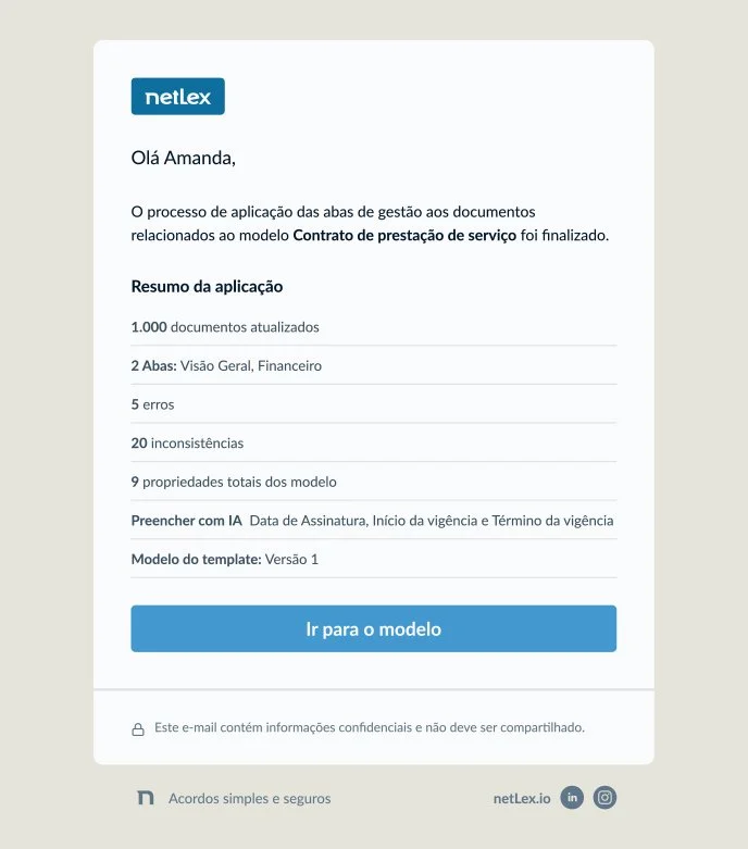
The update runs in the background with a progress bar. When it's done, the user gets an email with the results, and can open the platform to see errors and AI outcomes.
Notification
Entry point
Design
Key Design Decisions on Granular AI fallback
Granular AI Fallback
A real accuracy analysis showed that AI reliability varied a lot depending on the data type. It was high for dates and contacts, but low for complex financial fields. This finding supported replacing the original binary choice, use AI or not, with granular control by property, letting users decide where they trusted the technology.
Design note : In the AI fallback, we followed the design system, aligned with another team that used the same screen.
Keeping the Choice Safe
AI stays opt-in and is never enabled by default. Properties that are not eligible remain visible but disabled, and eligible properties get a visual indicator consistent with the rest of the product.
“We need to see all the other properties on the tab too, not just the ones with AI. This will be a huge gain for us.”
Implementation specialists
Key Design Decisions on the Final report
First version
Error Reports Grouped by Root Cause
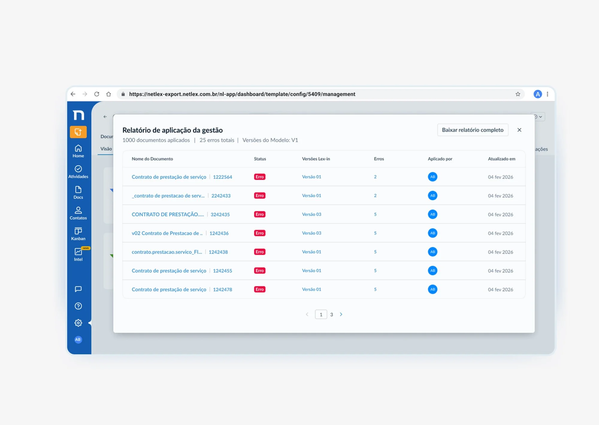
After usability tests, we changed the report structure. Instead of listing hundreds of failures by document, the system groups them by property. This makes it much faster to find and fix problems in large executions.
Inconsistent visual identity
Colors lacked semantic consistency, functioning as decorative assets rather than cognitive data indicators.
“Looking at the document doesn't really help us here. The screen looks nice, but it's not what we need. I need to see the properties and the type of error.”
Implementation specialists
Updated version
Real impact
Faster Execution and Increased Autonomy
From Weeks to Hours
We cut legacy document update time from one to two weeks down to about 2 hours. This removed the manual back and forth between Implementation, Engineering, and Data.
Business Autonomy
Implementation teams could now update a client's document base without asking Engineering for help. This lowered operational risk and gave control back to the people who run the process every day.
Learnings
The Value of Continuous Discovery
Continuous discovery was key. It helped us find needs that would never have shown up in the initial requirements alone.
Small Decisions, Big Trust
Small UX decisions had a big impact on user trust. Separating errors from inconsistencies, and giving users granular control over AI, are two examples.
Working Close to the Team
Working closely with Product, Engineering, and Implementation turned a very technical process into something people could understand and rely on.
Balancing Simplicity and Safety
Designing critical operations means balancing simplicity, safety, and scalability.