

Sabor Econômico
Mobile App

My role
UX/UI Design, Prototyping & Testing, User Research,Visual Identity, Design Leadership, Usability Testing.
Team members
Michele Seixas, Valéria Rezende
Tools
Figma, Illustrator
This product was designed to tackle a dual challenge: mitigating food waste while empowering low-income populations to access affordable, nutritious meals.
My Role As Product Design Lead, I owned the user research framework, discovery tracks, and end-to-end UX/UI architecture. I structured the user interview guides, mapped usability testing protocols, designed the core marketplace mechanics, and established the app's visual identity system.


48,4%
of people do not buy sustainable products due to the high price.
75%
acquire information about sustainability through social media or websites
78,9%
of the sample consume fruits, salads, legumes, and vegetables.
The App
Sabor Econômico is a local B2C marketplace that aggregates surplus food, surplus items, and produce nearing its expiration date at discounted rates. By digitizing inventory with minor visual imperfections, the platform directly solves food insecurity for low-income families and reduces overhead costs for local food entrepreneurs.
Problem Statement
As the primary grocery shopper for my household, I want to purchase affordable food while actively reducing food waste, especially given the rising food inflation in Brazil. However, I cannot find a centralized channel that balances quality and cost, forcing me to travel across multiple fragmented retail locations to complete my shopping within a strict budget.
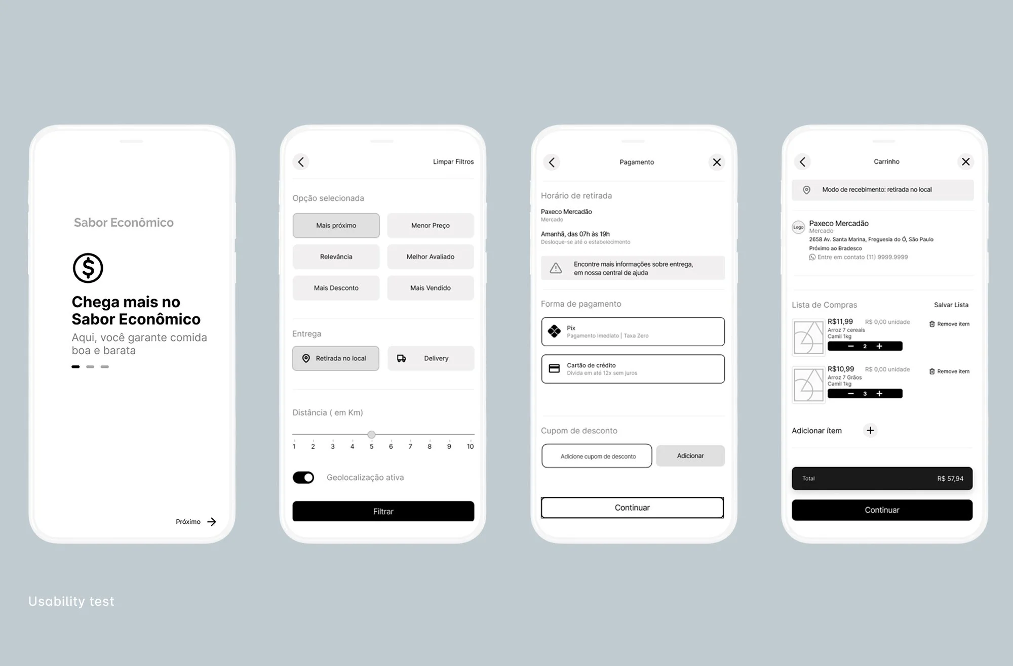
Key Usability Findings
Location Transparency Users needed explicit, contextual clarity on why the app requests geolocation permission, ensuring they immediately understand that the listed stores are sorted by physical proximity.
Cart Findability: The shopping cart icon lacked visual prominence, causing noticeable cognitive friction and delays when users tried to proceed to checkout after adding items.
Textual Guidance (Microcopy): Participants expressed a need for clearer instructional text and onboarding cues, particularly during the app's initial screens, to guide their first interactions.


Visual Identity Strategy
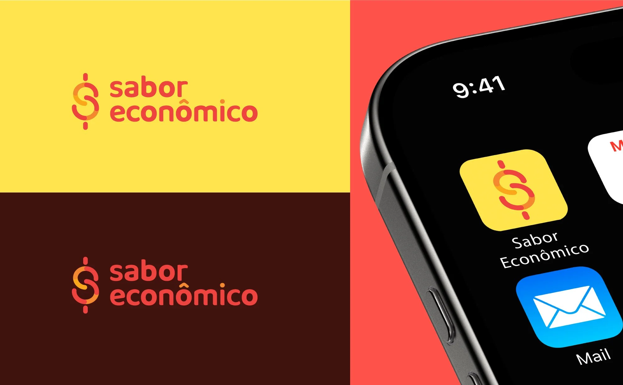
The color systems leverage warm palettes (reds, oranges, and yellows) systematically proven to stimulate appetite and capture user attention within digital retail environments.
The icon reflects the business strategy, combining awareness of the act of consuming with affordable prices.

Learnings
Price is very important Research validated that for lower-income brackets, cost efficiency is the ultimate conversion driver; sustainable patterns are adopted as a byproduct of financial savings, not an ideological preference.
Leveraging Mental Models Adopting familiar checkout and search architecture patterns from established industry players drastically reduced the user's cognitive load, accelerating test completion rates during validation.